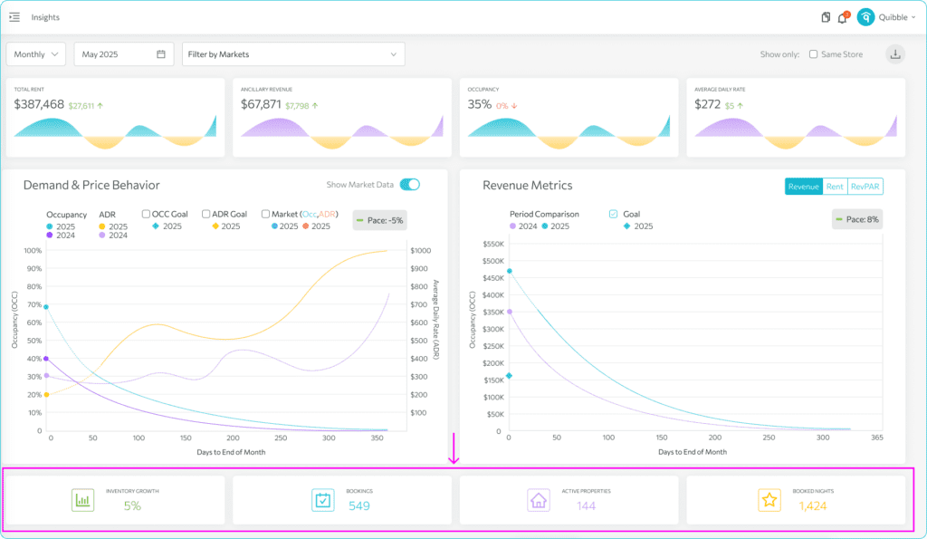
Understanding the metric graphs and statistics
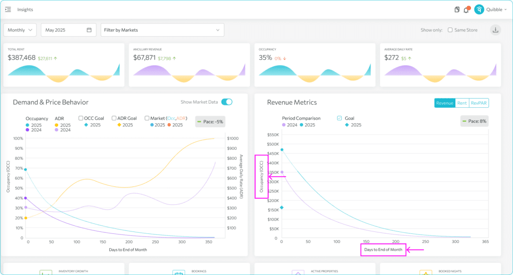
The Insights graphs visualize the top cards over time. Read them right to left: the X-axis counts down the days until the period ends, where day zero is the last day of the month.
The graphs plot the first-layer card values over time, showing trends.
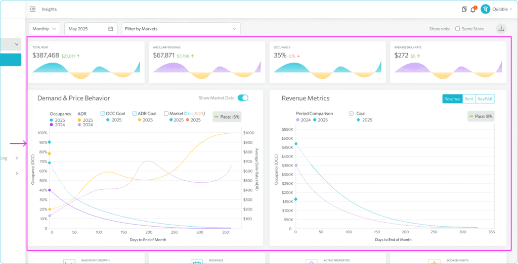
Gaps show the difference from the prior year; forecast dots on the left indicate expected period completion. Hover for specific values.
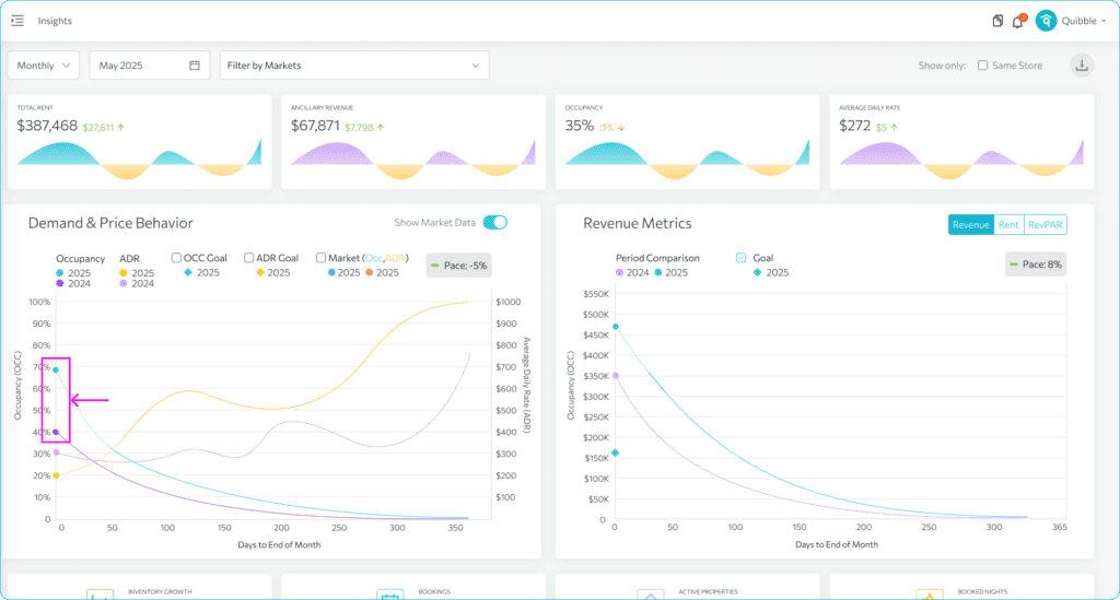
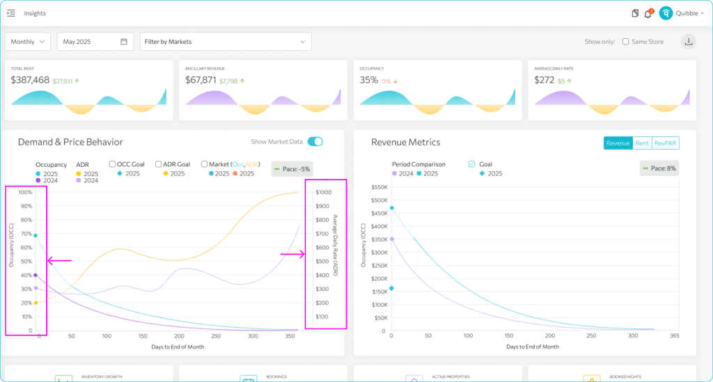
The demand-and-price graph shows occupancy and average-price trends against the previous year to help forecast.
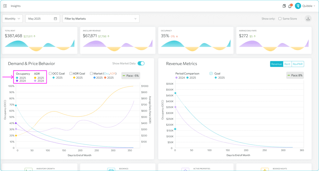
Occupancy (left) tracks booked-inventory percentage; ADR (right) shows the average daily rate in your portfolio currency.
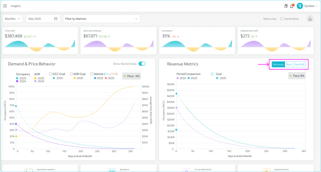
The revenue graph covers Revenue, Rent, and RevPAR — X-axis is remaining days, Y-axis is revenue.
Toggle between the three: Revenue is rent plus ancillary fees, Rent is just the nightly rate, and RevPAR measures earnings per available night.
Below the charts, the portfolio statistics cards aggregate the period — inventory growth, bookings, active properties, and booked nights.